Enabler provide best practice advice and guidance on email design within B2B and B2C email communications. Check out Enabler’s top tips for email design.

The Graphics Interchange Format or GIF (although some people say ‘JIF’), turned the big 3-0 this year (2017), so we thought we’d say Happy Birthday – but now we feel old!

When someone says ‘GIF’ to me, it still conjures up images of 1980’s Space Invader icons waving their little pixelated arms, but now that we’re 30 years on, the GIF has taken on a new form and is slowly taking over the world of email campaigns.

A Brief History of GIF

As simplistic as the animated GIF once when the Space Invaders were all the rage, the GIF has now developed into something that doesn’t have to look so simplistic.  GIFs today are, as Daft Punk once said, are harder, better, faster, stronger. They have stood the test of time, and are now more detailed, bettered designed and better developed.  The GIF, simply put, is the underdog image-equivalent of Rocky Balboa, that always comes out fighting and on top.

GIF hasn’t always had the ring to itself when it comes to animated imagery.  Some early GIF contenders included MNG (Multiple Image Network Graphics) and APNG (Animated Portable Network Graphics).  Both used animated image graphics based around PNG, but were knocked out in the first round by development issues that hindered their progression.
Next on the scene was Adobe Flash, who went the full 12 rounds, threatening GIF’s title as the go-to animated image. Luckily for GIF however, Adobe Flash retired early due to security flaws and restricted mobile performance.

Today, GIF is being pitted against the new kid on the block – HTML5.  This newbie is the most current markup language that utilises new animated elements like the <video> tag for the display of short, silent, looping, moving picture files – examples of which can be found on Gfycat and Imgur.

However, even with this new contender, the GIF is still fighting strong after 30 years as one of, if not the most successful animated image, thanks not only to its versatility but also its accessibility.  You can find a GIF of almost anything, and with so many sites offering up high quality, easily downloadable and shareable GIFs (our personal favourite is giphy.com by the way), there’s no reason why you shouldn’t be using GIFs.

So Why Use GIF In Your Emails?

Over the years, the animated GIF naturally progressed out video games and into our emails. These little video gems act as the perfect format to capture someone’s attention within the inbox, as Dell discovered when they launched their XPS 12 Convertible Ultrabook™, using an animated GIF to show off it’s flip function.

In fact, an animated GIF incorporated into your emails can help increase click-through rates by up to 42%.

How Will You Use Yours?

Depending on your email content, GIFs can be utilised in a variety of ways: for fun, style or informative. Here’s some examples below:

Fun Promotions

One of the most ‘must-watch’ TV shows right now is the NETFLIX Original Series “Stranger Things”.  To promote the launch of the new season, Netflix used a creepy GIF in their email marketing timed perfectly with the show’s backdrop and released just before Halloween.

Another creepy example comes from Email Monks, who showcased a creative yet spooky CSS3 which featured an interactive GIF for their “Annabelle Creation” email, with clever animation, click response and some extra eerie added sound.

Style

Big brands like Nike are known for producing some very clean, stylish emails featuring  big images and subtle GIF animations.

Uber produced a simple but very effective looping GIF for their email marketing campaigns, featuring a great branding style combined with some simple animation.  Just goes to show that your GIFS don’t have to be hugely elaborate – sometimes clean and simple (if done right) can look stylish.

Informative

Show off their new VW Beetle, Lego used an animated GIF carousel within their email campaign, showcasing image comparisons, different viewpoints and workings of their beach bug. So remember, sometimes a simple carousel of images can be the most effective GIF, rather than something elaborately complicated.

Everyone loves a ‘How-To’ video, which is why the GIF in Harry’s Instagram email campaign is so effective, with its short run-through of their Instagram account featuring an interactive behind-the-scenes experience. Simple but informative.

So Now To The Eternal Debate…

Is GIF Pronounced With A Hard ‘G’ or Soft ‘G’? – that is the question.

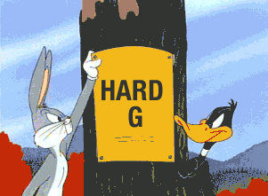
Apparently the GIF developer, Steve Wilhite intended a soft G, saying it deliberately echoed the American Peanut Butter JIF. Personally I would say hard G, as the G does stand for ‘Graphics’ after all. Even the former President of the US, Barack Obama had his say on the matter:

“A GIF, I’m all on top of it. That is my official position”
Barack Obama

What Does The Future Hold For GIFs?

Brought up on the Netscape streets, the GIF fought it’s way through many a animated battle to become a legend graphic amongst its peers.  From kids to professional marketers, everyone loves using a GIF.  These little snippets of animation can capture your attention and your emotions in a way that a still JPEG just can’t – and it’s for that exact reason that email marketers love the GIF so dearly.  The GIF has adapted to its competitors to become the champion of the animated image, and just like the JIF/GIF debate, the GIF will be around for a long time to come.

So, with the festive holidays approaching, I will leave you with the full GIF movie of ELF.

Enjoy!

Video may have killed the radio star, but it’s certainly alive and kicking in email.

You probably already know this, but adding captivating and entertaining videos to your email content can significantly increase your click-through rates.  Having video content that drives end users to take actions, helps provide you with a better insight into user engagement and interactivity, and as Michael Litt once said…

“The play button is the most compelling call to action on the web”
Michael Litt – Vidyard CEO

Let’s take a look at the different types of video is being utilised today, plus some coding tips on how to implement video within your own email marketing.

Lights, Camera, ACTION!

The Prequel

In today’s online world, video is everywhere – streaming out the sides of the internet and going full screen on every platform. Videos online evolution can be associated with renowned sites such as YouTube or Vimeo, both created in the early 2000s. These types of sites have transformed the way we see and interact with videos online, paving the way for video sharing, streaming, higher visual and sound quality, and the significant development of audience targeted programming.

Nearly all social media channels today have involvement in video; Facebook, Instagram, Snapchat, Google+, Twitter – to name a few. So it’s no surprise that videos next evolutionary step was into email… in fact it would have been unusual not too.

The Main Feature

So let’s take a look at how you can take advantage of the benefits of having video within your own emails, by giving you some helpful tips on how best to implement it.

Please place your mobile phones on silent, turn off any recording equipment and sit back and enjoy the show…

There are two main ways of placing video into your emails.

The first would be to have an actual mp4 video file playing directly within your email using HTML5 video, with a fallback image for those email clients that cannot play video.  Unfortunately because the list of email clients that support a full working embedded video file is quite limited, the fact is your fallback image is more likely to be displayed than your video… which makes your video file a bit of a B movie email.

The second, not so advanced but more widely accessible method, would be to incorporate a link to a video within your email by using an animated image or GIF of a video. Utilising a GIF (see below) instead of a full video file ensures your video is more likely to be supported by email clients.  So your end user gets the impression of a full working video, while you relax knowing you haven’t got the drawback of your video not displaying within your email.  Using a video format that’s more widely supported, like a GIF, allows you to reap the benefits of having a blockbuster email that drives higher engagement levels.

For more information on the benefits of GIFs, check out our blog: Quick Guide to GIFs in Your Emails

The Visual Effects

Now, if you do decide to go down the route of embedding a full video file with a fallback image in your email, we’ve got some technical tips to help you along the way.

Let’s take a look at the code* below and go through how we actually get a video embedded within an email.

As this is a HTML5 build we can start with simple doctype: <!doctype html>

Within the stylesheet the video is wrapped in a display: none, until requested to display: block, dependant on the viewing platform. Vice versa for the Video fallback.

The @supports styling are workarounds for different iOS platforms and a Yahoo fallback. #MessageViewBody is for displaying video with the Samsung email client on the Galaxy range.

The next two sections are the video section, with a pre-play/poster image, and the first fallback image, for those email clients that don’t play video.

The second fallback section is for email clients that load the pre-play image but won’t play the video. This just links an image to an online or streamed version of the video.

The size of the video can be set inline, currently 320×176, just remember to set/change it for the fallback image as well.

<!doctype html>
<html>
<head>
<title>Jellyfish</title>
<style type="text/css">
.video-wrapper {display:none;}
@media (-webkit-min-device-pixel-ratio: 0) and (min-device-width:1024px)
{
.video-wrapper { display:block!important; }
.video-fallback { display:none!important; }
}
@supports (-webkit-overflow-scrolling:touch) and (color:#ffffffff) {
div[class^=video-wrapper] { display:block!important; }
div[class^=video-fallback] { display:none!important; }
}
#MessageViewBody .video-wrapper { display:block!important; }
#MessageViewBody .video-fallback { display:none!important; }
</style>
</head>
<body>

<!-- video section -->
<div class="video-wrapper" style="display:none;">
<video width="320" height="176" controls="controls" poster="blob:https://docs.google.com/91acb26d-2833-4aa8-ae04-b37816b9a9e6" src="http://mirrors.standaloneinstaller.com/video-sample/jellyfish-25-mbps-hd-hevc.mp4" >
<!-- fallback 1 -->
<a href="http://mirrors.standaloneinstaller.com/video-sample/jellyfish-25-mbps-hd-hevc.mp4" ><img height="176" src="blob:https://docs.google.com/91acb26d-2833-4aa8-ae04-b37816b9a9e6" width="320" /></a>
</video>
</div>

<!-- fallback section -->
<div class="video-fallback">
<a href="http://mirrors.standaloneinstaller.com/video-sample/jellyfish-25-mbps-hd-hevc.mp4" ><img height="176" src="blob:https://docs.google.com/91acb26d-2833-4aa8-ae04-b37816b9a9e6" width="320" /></a>
</div>

</body>
</html>

The Sequel

Now if you’re not one for coding, there are some companies, like playable.video, that will take your video file, convert it and provide a 10 second clip with the code to embed into your email.

Our best practice top tips would be to use a small video file size within your emails – just like images you don’t want a long download time. So if you like the mentality of “build it and they will come”, having engaging video content within your emails could give you that edge over your competitors, meaning more subscribers, more clicks and potentially more sales!

Updates and testing are ongoing for video in email.  The above code was edited at the end of 2017. In the meantime, “the first rule of video” is not to forget the fallback imagery… “they may take our video, but they will never take our images!”

The future of video will hopefully provide streamable videos directly in your inbox, meaning “where we’re going, we don’t need fallback images”…but that’s (potentially) in the future.

So “show me the videos” and lets see your emails go “to infinity and beyond”, and “I’ll be back” soon with more blogs.


*Code from Justin Khoo of Freshinbox – Codepen https://codepen.io/freshinbox/pen/yMLLoX

Half the battle of any email campaign is managing to grab your audience’s attention with engaging content, the other half is making sure you convert that attentive audience into interacting with your content. Even with high open rates, this doesn’t necessarily mean you are really engaging with your audience. It is quite common to see low conversion rates when emails aren’t centred around getting the customer to focus their attention towards a particular call to action.

Every day we receive a number of emails in our inboxes covering a wide range of subjects, from informative updates to newsletters we may have signed up for in the past. But what sparks that first half of engagement makes us want to open the email instead of just swiping left and deleting it?

Placement

We all know a catchy subject line works wonders for increasing call to action activity.  Once we get the audience reading the content of the email, the next half of the battle begins, and the emails that always seem to prompt us to actively engage with them are those which appeal to our interests.  In general, if you want your call to action (CTA) to catch the reader’s eye and drive active engagement, you need to give careful thought to the CTA’s placement within the email and and the precise language you use to grab that attention.  Effective calls to action are based around good design and good use of text which indicates a reward for clicking, at the end of the day there’s a reason they are called ‘calls to action’, so be sure to use text that encourages readers to take action and include strong visuals with a sense of immediacy.

A great example of CTAs being put to good use is when artists release new music online.  In this day and age, success is (sadly) determined by how many listens an artist’s song can accumulate, as opposed to actual record sales.  Emails promoting new music releases are a great example of CTAs that have a clear immediacy which rewards the reader for clicking, providing the reader with an abundance of opportunities to listen to the track straight away from within the email.

Phrases like ‘click here’ provide no real reward for clicking, as they do not provide the reader with any incentive for clicking or an indication of what they will see once they do click ‘here’. The best CTAs utilise text relating to what you are offering as they provide a more attractive incentive to the reader, which in turn is more beneficial to your marketing campaign.  The example below is a simple but effective CTA used by Chipotle from one of their recent campaigns.  The term ‘claim now’ instantly gives the reader the impression they will receive something by clicking (in this instance, a free burrito), which helps achieve the marketing goal by driving click throughs and ultimately ensuring retention.  (Just as a side note, depending on the styling of your email we would recommend not centre aligning your text as it is less accessible and can sometimes be harder to read).

Be aware about the positioning of the call to action within your email template. The main aim of including a call to action is to get people to click on it, so for example by placing it near the bottom of a long email will not do you any favours. Ideally, you want it to be in a prominent place so it is recommended to keep it above the fold of the email, this should ensure nobody ever misses the CTA and it gives the reader the opportunity to know fairly soon what they will get as a result of opening the email.

Styling

Consideration can also be given to focusing text around the first person, for example changing ‘your’ to ‘my’.  Of course this all depends what the subject is, but through simple A/B testing you will be able to see which works best for you.  Our in house email software, Enabler, gives you the option to split send to your database, which is a great way to see how a particular set of customers react differently to others. Discover how A/B testing can help you achieve more from your campaigns here.

One important thing to remember is that a call to action is not just a meaningless small button tucked away at the end of an email.  In order for it to be effective, the call to action needs to be relevant to the content of your email, and on some occasions the subject line.

If more than one call to action is required in the email, then you need to add variety to your CTAs by avoiding using the same one throughout. Different calls to action will trigger different emotions for people, so by adding multiple and varied CTAs which ultimately have the same goal increases the chances of getting that message across to the reader and encourages them to click.

These screen grabs from a recent Dr Martens email include different CTAs showing the reader the variety of products currently on offer, while also relating with the email subject line ‘Most Wanted Docs’ and overall message.

If your email requires more than one call to action to be included, decide which is the most important and make it stand out more than the others. This will not only ensure your promotion stands out, but also give the customer the option to choose another route if they so wish.

It can be beneficial to leave plenty of white space around calls to action – a recent study by UX found user activity increased by 20% in email that incorporated white space into their templates (and around CTAs). Due to the CTAs impact as a result of the white space, other components such as images and font colours stand out better. Sometimes less is more and in this instance having some form of white space goes a long way to getting the customer to view your products and/or services.

Creative

Calls to action do not necessarily need to be limited to just text. Over the past few years we have seen an increase in the usage of imagery and animation not only in email but in most forms of digital communication – anything from a meme to a GIF. With regards to GIFs, including them can definitely help towards a larger conversion rate. They add an extra element to the overall look and feel of your template designs by providing a much more visual (and in some cases literal) portrayal of your content.  GIFs allow you to tell more of a story and have a clearer message that takes away some of the (mis)interpretation text-only emails may cause.  Having a more visual CTA could be the advantage you are looking for to get ahead of your competitors.  Here’s examples of good GIF usage:


Overall, a good call to action within an email is one which grabs the users interest and encourages them to click through. They are an integral addition to any template especially when the objective is for example to promote a product or event, placing importance on the design, placement and integration of a CTA will help you get much more from your email campaigns.

Is it a bird? Is it a plane? No it’s Kinetic Email!

“Kinetic email… what’s that?” we hear you say. “That must be the latest in email development!” Well… actually, despite sounding like a new type of superhero, Kinetic emails (or as we sometimes call it ‘Captain Kinetic’), have been around for a few years now.

Kinetic email was coined by the Oracle Corporation in July 2014 for their B&Q email marketing campaign. The email they produced used HTML5 and CSS3 and contained an interactive hero image carousel, which was triggered by mouse hover buttons.

B&Q had great results from their debut Kinetic email;

  • 18% increase in responder-to-open rates, with 32% increase among club members.
  • 42,000 click-throughs to the website.
  • 30% decrease in time spent on email.

(Click here for the full marketing report from Oracle.)

The clever part of using a kinetic carousel image which housed all the information and links meant there was less time spent in an email by the user.  A regular email format would have seen users scrolling down through different sections, with the information and links spread out across the email – the Kinetic Hero, however, had everything in one place.

B&Q successfully decreased the time spent in email and upped the click through rate, by directing the user (via the interactive carousel), without the need to scroll through the whole page.

The Power of Kinetic

So the basis of Kinetic images within email is the use of CSS3 transitions and animations, which opens up lots of possibilities for captivating or interactive emails.
Some dynamic content examples that Kinetic email might utilise include:-

  • Hamburger style menus
  • Forms
  • Graphs
  • GIFs
  • Polls
  • Tap to reveal
  • Flip / hover / carousels or slideshow images
  • Embedded video and more…

As you can see, Kinetic Heroes have a lot of work to do.

Kinetic Heroes And Their Many Disguises…

Just as superheroes have their different identities, i.e. Spider-Man and Peter Parker or Superman and Clark Kent, Kinetic emails can be broken down into three different types:

1. Kinect

These are the emails that utilise CSS transitions and animations. A good example of this is the auto scroll carousels.

2. Kinetic Interactive

These type of emails are where the user actually interacts with the email. The example below has a collapsible hamburger menu. Other examples could be a carousel where each slide has a clickable button.

If you’ve read our previous blogs or visited our site before, you’ll probably have gathered that Enabler is a piece of email software. However, what you might have missed is that Enabler is more than just your bog-standard piece of email software, sporting sophisticated features which go beyond bulk sending emails. *Cue gasps and other associated shocked noises*

One of these features is Enabler’s Form Builder – you can use this clever piece of kit as a standalone form, embed it into a landing page or website, or use the form as a back-end tool for data capture. To demonstrate how effective these sophisticated Enabler Forms can be, I’m going to showcase a recent example from one of our clients, Real Estate Management UK Limited (REM) – asset manager for The Shard – where we utilised Enabler Forms in their Shard Lights 2017 marketing competition.

The Brief

Driving Engagement for an Iconic London Brand

Since 2014, The Shard has hosted a light show from it’s spire every December, aptly named #ShardLights, to celebrate the festive season. In 2017, Shard Lights introduced five colours into its show, rotating one per day with an array of visual effects including gradients, patterns and sparkles. These visual light effects occurred every 15 minutes, with an extended display on the hour which transformed The Shard into a spectacular visual timepiece for London.

Now, Enabler’s offices are based literally around the corner from this stunning London landmark, but not everyone is lucky enough to have such natural daily exposure to this amazing light show.

So, to ensure maximum engagement with The Shard during this time, the REM marketing team wanted to run a photography competition to encourage the public to take pictures of The Shard’s light show and share online using the hashtag #ShardLights.

As an existing Enabler client, the marketing team at REM gave our campaign management team the task of creating an engaging campaign with the following key requirements:

  • Hosting the photography competition
  • A way of collecting entries and associated entrants information
  • A trigger email going out post competition submission to recipients


Our Solution

We decided that the best way to achieve the goals laid out in the brief, would be to build a standalone landing page within Enabler which hosted the photography competition. We would then create a built-in Enabler form within this landing page, which would trigger an email to the recipient when completed to confirm that their entry had been received.

The Design and Build

For such an iconic London landmark, the design for the landing page was incredibly important. Our team of designers had to ensure stunning imagery of The Shard, provided by the REM team, was being used whilst also making sure all the relevant information was clearly visible on the page for entrants.

Here is the template webpage design before our specialists started the more sophisticated build:

When translating this design into the build, our developers took the simple static images within the email and transformed them into parallax scrolling images – this allowed us to display the full images without taking up too much real estate on the webpage.

The most important factor our development team focused on was ensuring the form on the frontend of the webpage was linked properly to the form on the backend of Enabler.  The REM marketing team were utilising Enabler’s database to house and access the data from submitted entries – so making sure the forms were linked was vital.


Using Enabler Forms for Data Capture

Enabler forms are extremely effective for data capture, allowing you to embed forms onto your website that connect directly into your marketing database. There are two main ways you can embed Enabler forms within an external system.

The first and simplest way is iframing, which involves taking a snippet of code that looks like this:

<iframe src="https://ue.enablermail.com/realestatemanagement/frm/index.cfm?id=A480A319-7983-4C4B-993D-E97064B7C7A5" width="750" height="500"></iframe>

You then embed this code within your desired webpages, which then displays your form exactly as it appears within Enabler – including Enabler’s styling and layout. This, however, wasn’t an option for the Shard Lights web build, due to the beautifully bespoke styling that was required from the form’s design.

Instead of iframing, we used the alternative method of embedding and Enabler form, which is the ‘Form post’ option.  Now, this is a much more technical way of approaching form submissions, but it does mean you can style your Enabler form exactly as you want on the frontend of your website.


Now For The Technical Bit…

To make ‘Form posts’ work, you have to tell your form to post submissions to Enabler’s servers. Each individual form field will have an ID associated with it, but all these fields will be stored in the same place in Enabler ensuring you can review and pull all the required data out at once. I’m not going to go into the super technical stuff because a) I leave that to my developers and b) you don’t want to hear it!

Once someone submits a form post, the message (seen below) displays on the website.

However, we also wanted to ensure that each entrant would receive an email confirming their submission as well (for added peace of mind that we had received their entry). To this end, we also triggered an email to go out each time a form submission was received, (as shown below), letting entrants know when the competition closed, and by what date they would be notified if they had won the competition. It also encouraged a social push for the competition for maximum social media traction, using the hashtag #ShardLights.


So, it’s all very well collecting this data and all these (hopefully) stunning images, but where would they all be stored? Now, usually with form submissions you go into the form, run a report and it shows you a list of text entries and what those entries said – however for a photography competition, we had to develop something a little different to display images…

If you’re sitting there thinking…”hang on that looks just like Enabler?”, then you’d be absolutely right. Our development team have created a bespoke image gallery where the REM marketing team were able to view all the images submitted at once (making it easier to select a winner), while also allowing them to click into each individual picture to see all of the details of the person who submitted the photograph.

Outcome

The competition ran from Monday 4th December 2017 until Sunday 7th January 2018, and received a total number of 871 entries. Some of the photos were absolutely stunning, and to be completely honest, some of the entries were basically close up selfies of peoples faces, but all in all we have some fantastic photographers out there parading the streets of London, and I don’t envy the REM Marketing Team having to pick a winner!

We had a fantastic time doing this project, it’s always great for our email team when we can really push Enabler’s functionality in ways that people wouldn’t expect from email software, helping our clients deliver beautiful emails alongside websites that really help them achieve their marketing goals.

Engagement levels like this also go to show the impact well thought out, well designed data capture forms can have on your marketing campaigns, and goes to show the importance of combining your data capture with your email marketing campaigns.


If you like what you’ve seen here or want to learn more about form functionality, please drop our Enabler team an email and we can talk about your next exciting project.

So, you’ve got your awesome email and you know what you want people to do when they receive it, but you could do with something to give them a final push to take action – that’s where landing pages come in!

What is a Landing Page?

In a nutshell, it’s a purpose-built page on your website with dedicated content which can be accessed directly via a link. Because the content for your landing page is usually unique to your marketing campaign, whether it’s a point of entry for a competition, a data capture form or a link to a unique discount code, your landing will normally sit separate from your main website. One big advantage of having a separate landing page for your marketing campaign is this ability to hide it from your main navigation, as it gives you full control over who has access to this exclusive content.

Now, because your landing page is hidden from public view, you need to being actively driving traffic directly to the page to encourage engagement. Whether it’s a link within an email campaign, PPC campaign or social media campaign, you want to ensure whatever channel(s) you choose to drive traffic will maximise exposure and engagement for your well-designed landing page.  The more relevant the landing page content is to your audience, the more likely they are to follow your call-to-actions, thus increasing your conversions. Having a specially-designed page is more likely to be effective than sending them to your main website, where they may struggle to find the promised content.

Additionally, many of our Enabler clients find that having a bespoke landing page is the most efficient way of getting a marketing campaign launched quickly.  It can often take months for changes to be made in-house to company websites due to IT backlogs, so having the ability to create dedicated landing pages yourself within Enabler is far more efficient.


So, what does a “well-designed landing page” look like? Let’s talk guidelines for setup and creation:


What is the Aim of Your Landing Page?

You’ve designed your bespoke landing page, so now the first thing you need to decide is – What is its purpose?

Generally speaking, this falls into one of two categories:

  • Generating leads for future marketing
  • or to encourage click throughs

Data Capture and Lead Generation

This type of landing page is designed with the intention of capturing your audiences’ data.  You could use this type of page to gather new consumer data or to build more detailed profiles of your existing audience base.  Alternatively you can use data capture forms to help you personalise your future marketing campaigns based on the consumer feedback.

A typical data capture landing page includes a form to complete (obviously), and more often than not include an incentive which will encourage people to complete the form and give you their information. This incentive could include exclusive content or offer, such as white papers or discount codes.

“Why would you want to capture more detail about your existing customers”, we hear you ask – well, the more you know about your customers, the better your campaigns can be, and the better your conversions.  So something as simple as “Let us know your birthday so we can spoil you on the day!” is a great way to offer an incentive while gathering valuable data.

Data Capture Landing Page Example:

This is a great example from our friends over at Salesforce – (as we’re a Salesforce partner this might be a little biased, but this really is a great example of an effective, well-designed landing page).

Why do we like this landing page?:

  • Minimal copy, well styled and bullet-pointed list ensures the overall page isn’t cluttered and is easy to skim read.
  • Check out those security badges below the form. It’s never a bad idea to assure potential customers that the data they are about to share with you is safe.  This can often be a massive issue with some standalone landing pages, as it’s very difficult to prove the landing page belongs to the company it’s advertising.
  • Eye catching content. Having that blue background on the data-capture form really makes it stand out, which will help drive engagement.
  • Catchy headline. Having a buzzword like ‘lightening’ makes it sound like it won’t take very long, which again helps to drive engagement.

Landing Pages to Drive Click-Throughs

This sort of landing page designed to encourage clicks often forms part of the e-commerce sales funnel. The page content is likely to be product information to warm the visitor up to the idea of buying the item(s), with a call-to-action click-through that takes the visitor to the purchase point.

Click-Through Landing Page Example:

Now as a general rule I’d always have the models looking at the copy they’re promoting, but this little guys face really sells the whole thing either way. ‘What else is good?’ I hear you ask:

  • Another cracker of a headline here. “Most Trusted” – having a snappy statement like this gives kudos to your brand and builds trust with the consumer.
  • The tick bullet-points makes the benefits clear and easier to understand than having them in a block paragraph.
  • The call-to-action button is clear and stands out (bright yellow will always do that!)
  • Mobile-friendly – The phone number in the top right is a click-to-call, making it super easy for viewers to contact Nationwide.

All in all, great job!

Designing Your Landing Page

Although we’ve mentioned that a landing page usually sits separately from your main site, you ideally want to ensure that it still reflects your branding and styling of your main website/ This way your online presence is consistent, offering visitors a seamless journey that doesn’t feel separate or disjointed from your brand.

It’s also important that visitors experience “message match” – meaning that the content on your landing page should reflect the message content they clicked.

Here’s a great email example that our Enabler designers created for our client Ralph Lauren recently:

Ralph Lauren’s Email:

As you can see, there’s a nice clear call-to-action for recipients ‘explore their gifting lookbook’, and the email content portrays the stylised content of the Ralph Lauren brand. So, what did this email link take you to…?

The Landing Page We Designed:

Anyone clicking the email link is taken to a dedicated landing page, hosted separate from the Ralph Lauren website, where you are greeted with a brief explanation of how the landing page’s ‘lookbook’ works.  The ‘message-match’ of the landing page mirrors the styling of the email perfectly, matching fonts and colours.

After closing the greeting box, visitors get to explore the promised lookbook – an interactive landing page experience:

Fully Interactive Landing Page:

The Ralph Lauren website wasn’t available for this campaign, so our designers had to fashion (see what we did there?) a bespoke landing page hosted separately on our Enabler servers.  This interactive landing page had lots of fun animated elements to make it appealing and engaging, and was a fantastic way to help showcase Ralph Lauren’s products separate from the Ralph Lauren website. This interactive element makes it a really great example of making the most out of your landing page.

Don’t Forget To Track Your Landing Pages

It’s all very well getting people clicking through to your landing page, but all that work is for nothing if they drop off without actually engaging with the landing page content. How will you know if people clicked through but then dropped off? How I hear you ask? Tracking! You can optimise your page using the same tracking you would use on your website (e.g. Google Analytics) to get all of this information.

What Next?

If I’m being completely honest, the best thing for you to do before putting a landing page together is come and speak to our team. We build landing page campaigns for global brands every day, it’s our bread and butter.

If you would prefer to build your own landing page, here’s a quick checklist of things to remember:

  • Keep your messaging consistent
  • Bright, clear CTA’s
  • Don’t overcrowd the messaging
  • Prove it’s a safe and secure site for gathering data
  • Make the benefits of signing up clear
  • Tracking, tracking, tracking

Happy landing paging!

“If you were a web font, what web font would you be?”

I was once asked a very similar question in a job interview, but that time it involved biscuits.

“If you were a biscuit, what biscuit would you be?”  It’s personal preference, and there is a wide choice of biscuits out there…and it’s the same with fonts, with designers and developers enjoying an immensely varied selection of standard ‘Web Safe Fonts’ or the more daring ‘Web Fonts’.

(And for those still wondering about my choice – it’s the Bourbon biscuit, always the Bourbon.)


Safety in letters

So what are the differences between Web Safe Fonts and Web Fonts?

Web Safe Fonts

These are the standard available system fonts found on everyone’s operating system. So it is ‘safe’ to assume it will render correctly across email clients and platforms.

The most common Web Safe Fonts include:

  • Arial/Arial Black

  • Helvetica

  • Times/Times New Roman

  • Courier/Courier New

  • Palatino

  • Georgia

  • Garamond

  • Bookman

  • Comic Sans

  • Trebuchet

  • Impact

  • Verdana

Out of these Helvetica and Arial are the standard fonts of choice, whereas others are frowned upon… like Comic Sans.

Comic Sans was released with Windows 95, it had a bright start in life, and this was possibly it’s downfall. “Hmm that Times New Roman header is just too serious, what can I use that’s more fun and quirky… Comic Sans, it even sounds fun.” The font was overused and wasn’t a good font to start with. The character weight too heavy and poor kerning (the space between characters) made it a designers arch enemy.


Web Fonts

These are licensed fonts, hosted and accessible either by purchase and download, or linked/imported via a host site like Google Fonts. Although these web fonts provide you with a much wider choice of fonts, they don’t yet all render 100% across all devices, so you should use them wisely.

At present, a small range of email clients accept web fonts, including:

  • Android (default mail, not Gmail app)

  • AOL Mail

  • Apple Mail

  • iOS Mail

  • Outlook 2000

  • Outlook.com app

  • Thunderbird

However this small number does cover the majority of the top 10 email clients being used today.

Google Fonts started up 7 years ago and provides fonts for free, but if none of the 800+ Font Families float your boat, you can always purchase fonts from numerous web font services, including:

Obviously hosting your own fonts is safer than relying upon a third party server. On the off chance that Google gets bored of providing free fonts and decides to stop the whole project, at least your “Gotham” won’t become “Georgia”.

Ideally web fonts should be an email designer/developer’s preference, the varied choice and potential impact of a unique font could help boost opens and drive click through rates, and without sounding like a supermarket advert, every little helps.


Web Safe or Not Web Safe?  That Is The Font Question…

The ability for your fonts to render properly in someone’s inbox can actually have a big impact on your click through rates, and not always in a positive way, so your choice between web safe fonts and web fonts is sometimes more than just a style choice.

For instance, you might think that ‘Lato’ font looks great in your new email newsletter, and when you see the ridiculously high click through rates of  70-80% you think you’re campaign has been a roaring successful. But when you look more closely, you discover that the majority of those clicks were people clicking a ‘download font’ link prompted by their device or browser because it doesn’t have or support the ‘Lato’ font.  This ‘download font’ link has now completely skewed all your click through rates and reporting stats.

So, think carefully before you choose a web font instead of a web safe one.

Now that you’ve made your font choice, let’s get them coded into your email.


Adding Web Safe Fonts To Your Emails

Looking at web safe fonts first, these would sit in the html as inline styles, like so:
(for this instance, we’ve chosen ‘Georgia’ as our web safe font)

<td align=”left” style=”font-family: Georgia, Arial, Times, serif; font-size:20px; line-height:30px; color:#000000;”>Extra, extra, read all about it</td>

Notice that the font-family has others listed after your initial or main font ‘Georgia’, this means that if for some reason Georgia doesn’t render in your email, ‘Arial’ will be next, then ‘Times’ and so on and so on – these are what is known as fallback fonts.

Outlook 2007/10/13 have Times New Roman as their default fallback font. Even if you set your own fallback fonts within your code, Outlook will ignore them.  However, if you want to avoid Times New Roman, this can be fixed with some code in the header:

<!–[if mso]>
<style type=”text/css”>
body, table, td {font-family: Georgia, Arial, sans-serif, Helvetica !important;}
</style>
<![endif]–>


Adding Web Fonts

We can add web fonts in a number of ways, but all are added to the head stylesheet of the email. As an example let’s use the popular Google ‘Roboto’ font.(https://fonts.google.com/specimen/Roboto)

After you have selected the “Roboto” font you will be given a Link or @import option.

<link href=”https://fonts.googleapis.com/css?family=Roboto” rel=”stylesheet”>

Or

@import url(‘https://fonts.googleapis.com/css?family=Roboto’);

Then to call the font you use font-family as normal:

<td align=”left” style=”font-family: ‘Roboto’, sans-serif; font-size:20px; line-height:30px; color:#000000;”>Extra, extra, read all about it</td>

The difference between Link or @import is the loading. @import waits until the html code is loaded, causing a delay to display, and a possible jump between the fallback font and the web font. Link is the opposite, it will load inline first as the code is read from top to bottom. Depending on the font used it could cause a delay for the whole email to display.

Link also offers the option of preferred or alternative style sheets.

The last font option is @font-face, this is possibly the most precise web font method.
It allows you to pick the file format from .woff, .woff2, .ttf, .eot & .svg. The former .woff format being a email developer’s choice, due to more email support.

@font-face can be dropped into the head style sheet just like @import and Link, and looks like this:

@font-face {
font-family: ‘Roboto’;
font-style: normal;
font-weight: 400;
src: local(‘Roboto’), local(‘Roboto-Regular’), url(https://fonts.gstatic.com/s/roboto/v16/DDBbt_SKtg0EqyMEnMOuTX-_kf6ByYO6CLYdB4HQE-Y.woff) format(‘woff’); unicode-range: U+0460-052F, U+20B4, U+2DE0-2DFF, U+A640-A69F;}

If you are obtaining the font from a provider like Google Fonts you will need to copy the url in the provided link and paste it into Internet Explorer or Safari to view the @font-face.

<link href=”https://fonts.googleapis.com/css?family=Roboto” rel=”stylesheet”>


There’s always an Alternative

Don’t forget your images Alt text, the web fonts have limited platform rendering, but there is no harm in adding some style. We are not talking anything fancy like a Velour jumpsuit and house slippers here, after all this is just the text that loads when your email image doesn’t.

That Alt text can be styled with font-family, font-size, font-colour, text-decoration etc. try and match the image style, and get your email looking good even before the images are loaded.

<img src=“images/grandpa-style.jpg” width=”200″ height=”40″ alt=“Grandpa Style” style=“font-size:16px; font-weight: bold; font-family: ‘Roboto’, Arial, Helvetica, sans-serif; color:#000000;”/>


Put the kettle on

So break open the packet of Bourbon biscuits, put the kettle on for a brew and go crazy with the multitude of font families at your fingertips.

So you’ve created the perfect email.  The HTML, CSS and design have all united together in a beautiful choreography, like a ballet dancer waiting to wow their audience.  Now – the last thing you want is for your email’s inbox performance to display View Online or Unsubscribe links as the first act people see.

You need to make an impact in the inbox, enticing the receiver to open your email above all others, and not delete it in one foul swipe.  “How do I do that?”  I hear you cry.  Fear not friend, Preview Text is your saviour.

What is Preview Text?

Preview Text is the first sentence or words from an email that are displayed in your inbox, under the Sender and Subject Line.

The format in your inbox runs like so:

Sender Name

Subject Line

Preview text

Most email providers, like Enabler, will let you control and customise the preview text that’s displayed in the inbox by allowing you to write your own sentence.  This way you can ensure you grab the attention of your audience before they even open the email, by avoiding the appearance of default text in your Preview Text – because lets face it, View Email Online isn’t really going to drive engagement.


Now You See It, Now You Don’t

There are two ways to use the Preview Text:

  1. Displayed in the email at the top

  2. Hidden in the code

More commonly, the Preview Text is hidden away to work it’s magic in the background.  If it’s displayed at the top or head of your email, it is referred to as a Preheader Text.  Don’t worry, you can still use hidden Preview Text alongside your Preheader.  If you set the Preview Text container above the Preheader in the HTML, it will appear first.  This could help push down text you don’t want displayed (like that pesky View Email Online)

Email Header example:

Get the best offers available today

To view email online click here

Email HTML example:

<body>
<div class=“preview-text” style=”display:none;font-size:1px;color:#333333;line-height:1px;max-height:0px;max-width:0px;opacity:0;overflow:hidden;”>Welcome to the new online store. </div>    
    
<table width=”100%”>
    <tr>
        <td align=”center” valign=“top”>
            Get the best offers available today <br>
            To view email online <a href=“##”>click here</a>
        </td>
    </tr>
</table>
</body>


Might look complicated, but what this clever piece of HTML does is bump the view email online text out of the inbox preview, like so:

Inbox results example:

Sender Name

Subject Line 

Welcome to the new online store.  Get the best offers available today.

The Preview Text Hack

So everyone has their own inbox display preferences, and sometimes we don’t get the choice.  You could be displaying 1, 2, even 3 lines of preview text, or annoyingly all of it – it all depends on the email provider.  This could result in the above inbox example displaying text you don’t want your audience to see, i.e:

Sender Name

Subject Line 

Welcome to the new online store.  Get the best offers available today. To view email online click here.

But don’t worry, we have it covered.  There’s a little hack that can help with this:

&zwnj;&nbsp;

No… I didn’t just fall on my keyboard and hit the keys at random.  This bizarre-looking strong of code stands for:

  • Zero width non joiners, or &zwnj;

  • Non breaking spaces, or &nbsp;

The idea is &zwnj;&nbsp; repeated will create white space after your preview text, effectively giving you an invisible buffer to bump down the unwanted copy from the Preview Text.

Example:

<div class=“preview-text” style=“display:none;font-size:1px;color:#333333;line-height:1px;max-height:0px;max-width:0px;opacity:0;overflow:hidden;”>Wow that’s short…&zwnj;&nbsp;&zwnj;&nbsp; &zwnj;&nbsp; &zwnj;&nbsp; &zwnj;&nbsp; &zwnj;&nbsp; &zwnj;&nbsp; &zwnj;&nbsp; &zwnj;&nbsp; &zwnj;&nbsp; &zwnj;&nbsp; &zwnj;&nbsp; &zwnj;&nbsp; &zwnj;&nbsp; &zwnj;&nbsp; &zwnj;&nbsp; &zwnj;&nbsp; &zwnj;&nbsp; Text you don’t want displayed</div>

The result, a beautifully tidy inbox display:

Sender Name

Subject Line 

Wow that’s short…

Emojis in Email

😀 😃 😄 😁 😆 😅 😂

These little characters have been around since the late 90s on our mobile phones.  In 2017, emojis have taken over our messages and have now stepped out of our mobile phones and onto the big screen with ‘Emoji Movie’.  There’s even a World Emoji Day on July 17th.

Now, coming to a subject line near you, the emoji is finding it’s place within your email inbox.

Like in the example above, some companies are opting for the subject line emoji as it can help capture the audiences’ attention, plus it allows you to have a bit of fun with the wide selection of icons available.

However, like a lot of new ideas in email (for example video or GIFs), emojis are not accepted across the board, as they will render differently across different devices and email platforms. Emojis are built around Unicode which is a standard set of figures that will display different emojis, for example:

U+1F602 = 😂

U+1F60D = 😍

U+1F601 = 😁

(A full list of emoji icons and their codes can be found here)

If you are planning on using emojis in your subject lines, test before you send otherwise your hip looking emails might turn out  looking a little square, as this ☐ icon will display if your emoji code can’t be recognised.


Roundup

A few more things to take into consideration when composing your Preview Text are:

  • Avoid letting the View Email Online into your Preview Text

  • Think of the Preview Text as a continuation of your Subject Line

  • Try some A/B testing with different Preview Text

  • Try not to repeat what is stated in the Subject Line

  • Test your Emojis

  • Try to use personalisation in your Subject Lines or Preview Text

  • Use the Subject Line or Preview Text to promote scrolling by referencing key points or articles lower down your email.

  • Be mindful of your character count – Preview Text can vary in different email clients and platforms, so don’t leave the best bits until the end.

Preview Text shouldn’t be an afterthought.  These small techniques can help to improve your open and click-through rates, and show your email as being professional and well thought out.


So go ahead, try some different combinations of subject lines and preview text.  Test, test, test those combinations, then sit back and watch the positive responses.

Well done!  Your performance is complete and your audience is demanding encores!

Say the words “Build me an email” to a developer and watch the expression on their face drop. Yes, HTML emails are old school, but there’s no need to don a loin cloth and start chipping out code from a stone tablet.

Email has come on leaps and bounds within the last few years, and with open rates frequently increasing on mobile devices, there are a few tips and tricks you can use for responsive emails.


Here are a few favourites to keep you building successful, responsive emails:

 1). Keep inline

If you have tried building an email before, you have probably heard of this one. This is basically adding any style changes you make to the containing table of your content.

For example:

<td style=”font-family:Arial, Helvetica, sans-serif; font-size:11px; color:#000000;”>Hello World</td>

The main benefit behind using this styling is that some email clients will strip out embedded CSS in the <head>, leaving your email with as much style as socks and sandals.

Email developers have already started trialing emails with no inline CSS, which are not 100% foolproof yet, but with a large percentage of global email clients supporting embedded CSS, there is hope for cleaner emails in the future.


2). Query your media

Let’s say you want that image smaller, or a different font for that block of text, or you need that column to stack on mobile… not a problem! Media query to the rescue.  Media queries are the CSS3 commands that allow you to change your viewpoint depending on your screen resolution,  meaning that your imagery and content will display differently on different devices… thus making your content fully responsive.

Within the <head> of any email there will be a minimum width set, for instance 480px which will control and sometimes constrain how your media is displayed.  But, if you add a media query to your style command, any styles that you set within that media query will take over when the screen resolution drops below the minimum width.

For example:

<style type=”text/css”>

    body {width: 680px;  background-color:#000000;}

    @media only screen and (max-width:480px) {
        body {width:100% !important;  background-color:#ffffff !important;}
    }

</style>

This means your image can be any size, the font family can styled differently for each resolution, and you can stack your columns all day long. Happy days!


3). Stacking

 We briefly mentioned stacking columns in the last tip.  As you’d expect, this coding command allows you to stack columns on top of one another by setting them as .stackonmobile {display:block;} for mobile. This coding tip helps with mobile optimisation by making sections of your email more visible and legible on smaller screen resolutions, instead of trying to squash them into one column.

The default for stacking was left to right for a long time, however more recently we can now reverse stack, by setting the containing tables text direction as right to left.

For example:

<table width=“600” dir=“rtl”>
    <tr>
        <th width=“300” dir=“ltr” class=“stackonmobile”>World</th>
        <th width=“300” dir=“ltr” class=“stackonmobile”>Hello</th>
    </tr>
</table>

Note that we need to redirect the sub-tables back to left to right for text alignment. Also the html layout will be reversed, right column first, which is why ‘World’ is before ‘Hello’ in the example above.
Also note that we have used <th> instead of <td> for Android compatibility, as they dropped the use of display:block on td’s.


4). Min vs Max

With screen resolutions getting bigger and bigger, is it a good idea to make our emails wider?
When I started in email builds (back in the dark ages of blackboards and chalk written HTML), the width was 585px. This slowly grew to a standard 600px, which seems to still be the acceptable size. Most of the emails we produce today are anywhere between 600px & 720px. Occasionally a 1000px email rears it’s oversized head, but these are usually for big occasions with large hero images for impact.

What we need to remember is that emails will still be framed by the email clients furniture i.e. the inbox list, the search and edit tools, sender details etc. So an oversized email might end up stretching beyond the width of the screen, which results in an ugly horizontal scroll bar at the bottom… and nobody wants that.

So remember, size does matter.  Always aim for the optimal image size depending on the platform or device being used to ensure your emails remain mobile responsive.


5). Bring it to the Table

With email development, it’s all about the tables. Below you’ll find an example of an email HTML table.

Example:
<table width=“100%”>
    <tr>
    <td align=”center”>
        <table width=“700”>
            <tr>
            <td align=”center”>
                <table width=“100%”>
                    <tr>
                    <td align=“center”>Hello</td>
                    </tr>
                </table>
            </td>
            </tr>
        </table>
    </td>
    </tr>
</table>            

The first outer table is set at 100% width to ensure the table is centred within the main body of the email itself.  Then the body table is set at your desired email width (i.e. 700px as above) with a 100% media query class.  By setting the tables within the body to 100%, this helps to ensure the content flows responsively when scaled down to a smaller screen resolution.


Handy tip: When building emails using tables, make sure you repeat your inline styles.  A table within a table will lose styling in some email clients, especially background colour and font attributes.
And another handy tip: Try and make sure you nest your tables, and avoid using colspans in your email code. Outlook has a nasty habit of ignoring colspans and rowspans, so nesting your tables will give you more control over your code, making you a happier developer.


6). A font by any other name

Be on the lookout in Outlook, your font might not be the font you wanted! 
Having a backup or fallback font within your email code is exceptionally useful to ensure your emails always look the way you want them to, even if the email provider doesn’t have your first choice font.

However… Outlook 2007/10/13 has other ideas, and will automatically apply their own fallback font or Times New Roman. Even if you set fallback fonts in your code, Outlook ignores them. Cheers Outlook.

But wait, there is a fix.. phew!
<!–[if mso]>
<style type=”text/css”>
    body, table, td {font-family: Arial, sans-serif, Helvetica !important;}
</style>
<![endif]–>

Drop this code into the <head> of an email and Outlook will pick up the web safe fonts first, so you can safely steer clear of Times New Roman.
Font-astic!


7). Does my article look big in this?

A bit of extra padding never did anyone any harm, but adding Padding and Margins to your table styles could harm the way your email looks, as some email clients might ignore them.

Spacer images used to be the way to use padding in emails. Developers would use transparent 12px x 12px gifs and fit them into every nook and cranny of their emails… sounds tedious doesn’t it?

Luckily there is an alternative which is much more efficient to implement, and works across all email clients successfully… A non-breaking space (&nbsp;) – just add font size, line height and a width/height depending on the space you require:


<td style=”font-size:20px; line-height:20px;” height=”20″>&nbsp;</td>

So now your emails and tables will always be lean and evenly spaced…no padding required.


8). The (Alt)ernative

 When your emails load quickly, you get to display every image and aspect of you email in all its glory. But what happens when you’re a slow connection speed or your email client is blocking images by default?

You could end up with empty spaces where your images used to be, but hopefully you will see the Alt text – the alternative text that’s displayed when an image can’t display.

Some email clients won’t load images automatically, so without any Alt text you could get a blank looking email. 🙁

Example Alt text:
<img src=“images/hello-world-title.jpg” width=”200″ height=”40″ alt=“Hello World”/>

Another alternative is to actually style your Alt text so that it’s less bland if it gets displayed. Add a font-family, font-size, font-colour or text-decoration, so you try and match the image style, and get your email looking good if the images don’t load.

Example stylised Alt text:
<img src=“images/hello-world-title.jpg” width=”200″ height=”40″ alt=“Hello World” style=“font-size:16px; font-weight: bold; font-family: Arial, Helvetica, sans-serif; color:#ffffff;”/>


9). Hamburger to go please

Now that emails have further CSS3 support, it’s allowed many developers to start introducing some great responsive features to their email code.

The Hamburger Menu (so called because it looks like a little burger between a bun) is one example of this.

Those long menus on an email don’t need to be stacked half way down your mobile screen anymore, they can be tucked away neatly in a clickable, drop down menu, making your email more mobile-friendly and more visually appealing.  Just need the fries to go with it now!


10). Give yourself a fighting chance

Make sure you are putting yourself in the best possible position for email building. One of the ways you can do this is to get the right software. Lucky for you, we’ve put together a list of our favourite email development tools, from design right through to deployment.

Check them our Email Tools blog and start getting the best results out of your emails.

Whatever you do, keep experimenting with your HTML/CSS emails, even if you end up with Frankenstein’s monster there might be a small part that works really well, or another that will give you a further understanding of where to go next.

Happy coding!

There are many things that contribute to the success of a business but the one I’m going to focus on here is marketing. Marketing is essential to any business. It takes time and skill to execute properly and hiring a digital agency can ensure you get the best value from your marketing budget and improve your results. Different types of agencies address different needs. Some agencies are focused on a particular area of digital, such as search (PPC, SEO etc), social media, email, web or strategy. Other agencies are full service and can manage all your marketing needs, including strategy.

But agencies though, I hear you say. Won’t they just cost me loads of money and come up with crazy ideas that don’t suit my organisation? You may have reservations, perhaps based on projects being taken out of your control, concerns about pricing, fear of “blue sky thinking sessions” and post-it-note-fuelled planning meetings eating away at your budget and time.


Fear no more, because using an agency can actually save you money and time, and I’m going to explain why.

1)    Agencies are experts

Digital marketing requires expert planning and execution to make it a success. The expertise an experienced digital marketing agency offers is invaluable, ensuring the best use of budget and resources to achieve your business objectives. You may have the best internal view of your business but an agency can bring you outsider market knowledge and fresh ideas. They may be working with clients in similar situations to you, meaning they’ve been there and got the t-shirt. Now they can make sure you sidestep all the pitfalls and navigate you smoothly towards success. As experts in their field, they’ll be fluent in the latest marketing trends and keep you up to date as well.


2)    Time management 

Agencies are time based businesses, which means they have worked out the best ways to get work done efficiently. They can help you achieve your goals in the most timely way possible and their processes can boost your own productivity. They’re focused on helping you achieve your business objective, on time and on budget.


3)    Maximise your budget

Many projects have a specific budget. Keeping this in-house can result in projects dragging on for far longer than needed, because it’s not Adam or Tom’s top priority and they have other work to focus on. Agencies will deliver your projects on time, and help you keep within budget. They can also advise you on the most cost-effective solution for what you’re trying to achieve. Many agencies offer different packages to demonstrate what can be achieved within specific budgets, and will work with you to ensure your project gets delivered to a high standard within a cost you’ve approved.


4)    Dedicated support

Internal projects can often get short-changed on support or resources, even with the best intentions. You’ll find exactly the opposite with an agency. They have teams of people who are essentially dedicated to the different parts of your project. From the Account Manager ensuring smooth communication throughout, to the Project/Campaign Manager keeping everything on track, or the Creative Team, everyone will be working to achieve YOUR goals. This provides valuable peace of mind, giving you one less thing to worry about and freeing you up for other work. You’ve also got people to celebrate with when your project goes live!


5)    Tools and tech

Digital marketing technology changes fast. Employing an agency means you’re not only getting access to the skills and expertise of their staff, you’re also benefitting from the latest tools and technology they use to make your projects happen. These might be design or web build related but the chances are, your in-house tech budget won’t stretch to cover them or it will take too long to get them approved and implemented internally. Agencies have them now, tested and ready to go.


6)    Perspective

Don’t underestimate the value of a fresh set of eyes on your strategy. An external perspective can help invigorate your marketing activity and open your eyes to opportunities you may not have considered before. A digital agency could have the answer to a problem you’re having, or show you new ways to innovate. The combination of your insider knowledge and agency expertise will ensure you hit or exceed your goals.


7)    Training

Agencies often offer training either as part of a package or separately. You could buy a particular product through an agency and get trained up on it to keep your costs down. This gives you some new tech to boost your marketing and access to the experts to teach you how to use it. Some agencies also offer training in methods of innovating such as Service Design and Design Thinking, which can help you to plan in a different way – essentially giving you the tools to create a successful new strategy.


8)    Flexibility

Agencies are not just there to run big projects for you; they can also be used for the smaller day to day operations of your marketing. For example, some agencies offer monthly retainers providing a certain amount of hours a month that can be used to utilise their staff as a flexible resource. A good example of this is email campaign management. (I’m a little biased here as this is what I do, but bear with me…) Let’s say you’ve been planning an email campaign to send out in three days and you suddenly realise you have too much on your plate and wish you could palm it off to someone else. Having a monthly retainer with an agency allows you to get in touch with your agency Campaign Manager and say ‘I need to send this out by this date, here are the details, please do it for me’… and they will! What could be better?

So, next time you’re thinking ‘I wish I had some more support on this’ or ‘I wish I knew how to make this work better’, don’t just think it, get in touch with a digital agency and let them help you to make your marketing more effective. And even better, get in touch with us here at Enabler.